Python數(shù)據(jù)可視化之基于pyecharts實(shí)現(xiàn)的地理圖表的繪制
百度地圖春節(jié)人口遷徙大數(shù)據(jù)(簡(jiǎn)稱百度遷徙),是百度在2014年春運(yùn)期間推出的一項(xiàng)技術(shù)項(xiàng)目。百度遷徙利用大數(shù)據(jù),對(duì)其擁有的LBS(基于地理位置的服務(wù))大數(shù)據(jù)進(jìn)行計(jì)算分析,采用的可視化呈現(xiàn)方式,動(dòng)態(tài)、即時(shí)、直觀地展現(xiàn)中國(guó)春節(jié)前后人口大遷徙的軌跡與特征。
網(wǎng)址:https://qianxi.baidu.com/2021/

語(yǔ)法
說(shuō)明
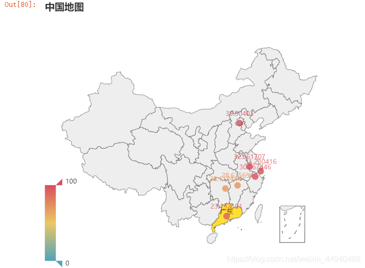
from pyecharts.charts import Geo 導(dǎo)入地圖庫(kù) Geo() Pyecharts地理圖表繪制 .add_map(maptype=“china“) 地圖類型 .add() 添加數(shù)據(jù) .set_global_opts() 設(shè)置全局配置項(xiàng) 三、中國(guó)地圖繪制實(shí)例代碼:
from pyecharts.charts import Geoimport pyecharts.options as optsfrom commons import Faker ( Geo() .add_schema(maptype=’china’) # 使用中國(guó)地圖的類型 .add(series_name=’’, data_pair=[(i, j) for i, j in zip(Faker.provinces, Faker.values())]) .set_global_opts(title_opts=opts.TitleOpts(title=’中國(guó)地圖’),visualmap_opts=opts.VisualMapOpts(# is_piecewise=True # 非連續(xù)型顯示) )).render()
運(yùn)行結(jié)果:
實(shí)例代碼:
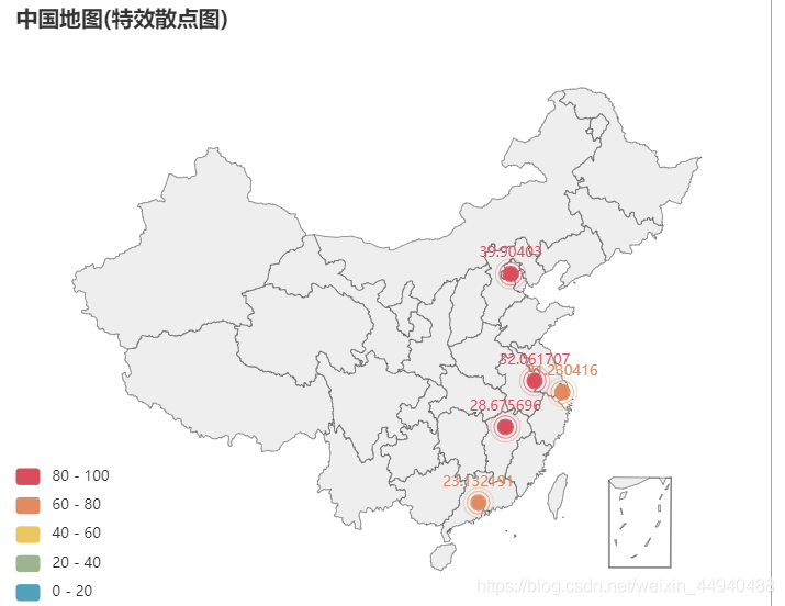
from pyecharts.charts import Geoimport pyecharts.options as optsfrom pyecharts.globals import ChartTypefrom commons import Faker ( Geo() .add_schema(maptype=’china’) # 使用中國(guó)地圖的類型 .add(series_name=’’, data_pair=[(i, j) for i, j in zip(Faker.provinces, Faker.values())],type_=ChartType.EFFECT_SCATTER) .set_global_opts(title_opts=opts.TitleOpts(title=’中國(guó)地圖(特效散點(diǎn)圖)’),visualmap_opts=opts.VisualMapOpts( is_piecewise=True) )).render()
運(yùn)行結(jié)果:
實(shí)例代碼:
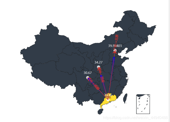
from pyecharts.charts import Geofrom pyecharts.globals import ChartType, SymbolTypeimport pyecharts.options as opts # 數(shù)據(jù)構(gòu)建(元組形式)city_num = [(’廣州’, 105), (’成都’, 70), (’北京’, 99), (’西安’, 80)]start_end = [(’廣州’, ’成都’), (’廣州’, ’北京’), (’廣州’, ’西安’)] ( Geo() .add_schema(maptype=’china’, itemstyle_opts=opts.ItemStyleOpts(color=’#323c48’, border_color=’#111’)) # 地圖形式設(shè)置 .add(’’, data_pair=city_num, color=’white’) # 地圖數(shù)據(jù)顏色設(shè)置(點(diǎn)) .add(’’, data_pair=start_end, type_=ChartType.LINES, # 設(shè)置線 effect_opts=opts.EffectOpts(symbol=SymbolType.ARROW,color=’blue’, symbol_size=7)) # 流動(dòng)箭頭繪制).render()
運(yùn)行結(jié)果:
實(shí)例代碼:
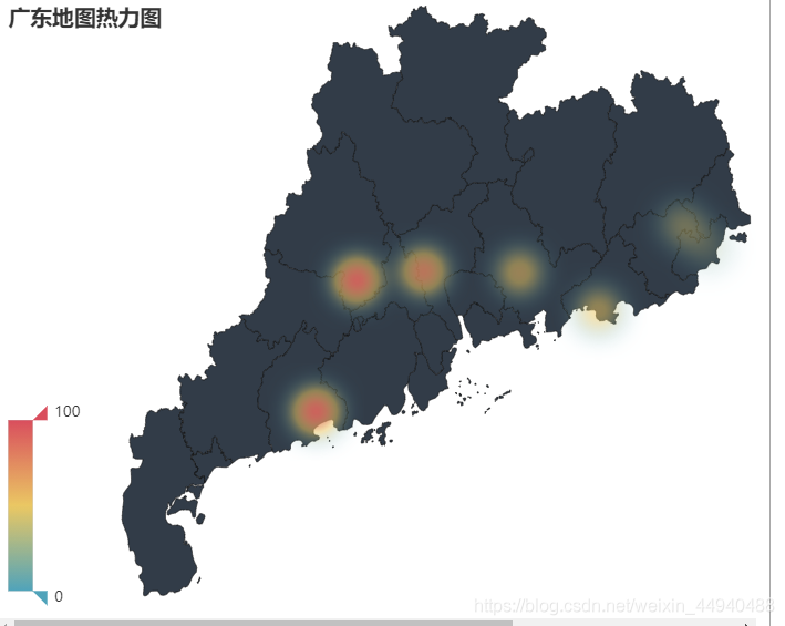
from pyecharts.faker import Fakerfrom pyecharts import options as optsfrom pyecharts.charts import Geofrom pyecharts.globals import ChartType c = ( Geo() .add_schema(maptype='廣東', itemstyle_opts=opts.ItemStyleOpts(color='#323c48', border_color='#111'),) .add('',[list(z) for z in zip(Faker.guangdong_city, Faker.values())],type_=ChartType.HEATMAP) .set_global_opts(visualmap_opts=opts.VisualMapOpts(),title_opts=opts.TitleOpts(title='廣東地圖熱力圖'), )) c.render()
運(yùn)行結(jié)果:
實(shí)例代碼:
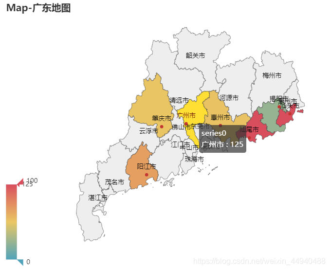
from pyecharts.charts import Mapfrom pyecharts import options as optsfrom pyecharts.globals import ChartType c = ( Map() .add(’’, [list(z) for z in zip(Faker.guangdong_city, Faker.values())], '廣東') .set_global_opts(title_opts=opts.TitleOpts(title='Map-廣東地圖'),visualmap_opts=opts.VisualMapOpts(), )) c.render()
運(yùn)行結(jié)果:
到此這篇關(guān)于Python數(shù)據(jù)可視化之基于pyecharts實(shí)現(xiàn)的地理圖表的繪制的文章就介紹到這了,更多相關(guān)pyecharts繪制地理圖表內(nèi)容請(qǐng)搜索好吧啦網(wǎng)以前的文章或繼續(xù)瀏覽下面的相關(guān)文章希望大家以后多多支持好吧啦網(wǎng)!
相關(guān)文章:
1. 以PHP代碼為實(shí)例詳解RabbitMQ消息隊(duì)列中間件的6種模式2. Python 如何將integer轉(zhuǎn)化為羅馬數(shù)(3999以內(nèi))3. python web框架的總結(jié)4. 詳解Python模塊化編程與裝飾器5. Python通過(guò)format函數(shù)格式化顯示值6. html小技巧之td,div標(biāo)簽里內(nèi)容不換行7. python裝飾器三種裝飾模式的簡(jiǎn)單分析8. Python如何進(jìn)行時(shí)間處理9. Python實(shí)現(xiàn)迪杰斯特拉算法過(guò)程解析10. python使用ctypes庫(kù)調(diào)用DLL動(dòng)態(tài)鏈接庫(kù)

 網(wǎng)公網(wǎng)安備