python實現(xiàn)股票歷史數(shù)據(jù)可視化分析案例
投資有風(fēng)險,選擇需謹(jǐn)慎。 股票交易數(shù)據(jù)分析可直觀股市走向,對于如何把握股票行情,快速解讀股票交易數(shù)據(jù)有不可替代的作用!
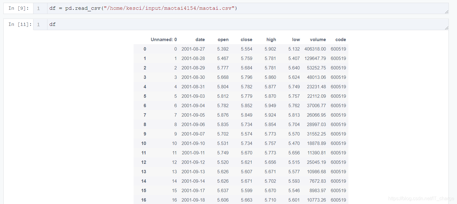
1 數(shù)據(jù)預(yù)處理1.1 股票歷史數(shù)據(jù)csv文件讀取import pandas as pdimport csv
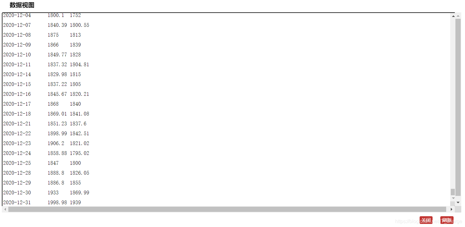
df = pd.read_csv('/home/kesci/input/maotai4154/maotai.csv')
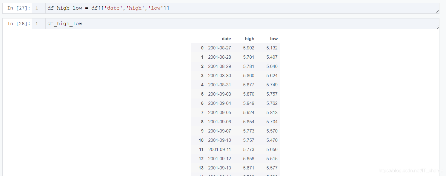
df_high_low = df[[’date’,’high’,’low’]]
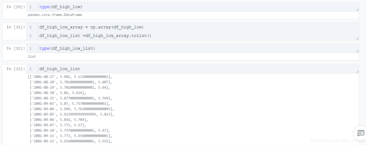
df_high_low_array = np.array(df_high_low)df_high_low_list =df_high_low_array.tolist()
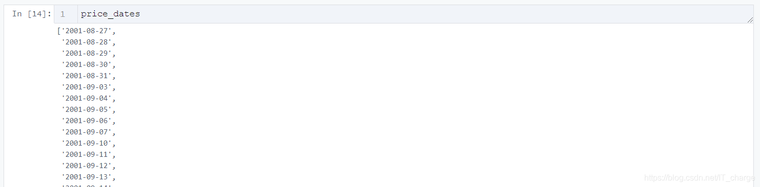
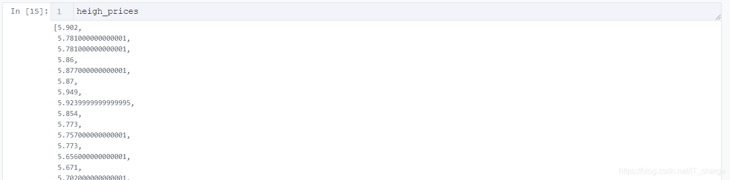
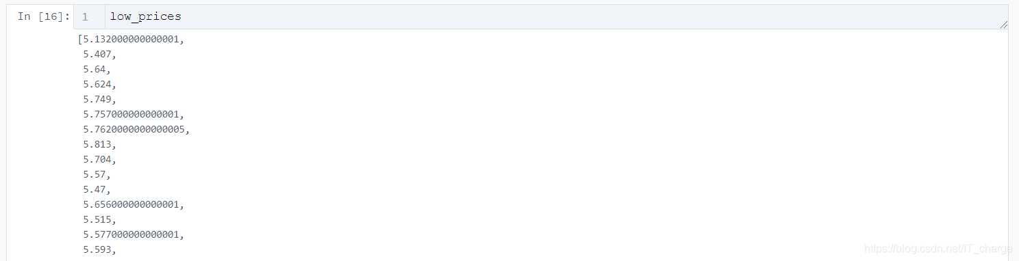
price_dates, heigh_prices, low_prices = [], [], []for content in zip(df_high_low_list): price_date = content[0][0] heigh_price = content[0][1] low_price = content[0][2] price_dates.append(price_date) heigh_prices.append(heigh_price) low_prices.append(low_price)
import pyecharts.options as optsfrom pyecharts.charts import Line2.2 初始化畫布
Line(init_opts=opts.InitOpts(width='1200px', height='600px'))2.3 根據(jù)需要傳入關(guān)鍵性數(shù)據(jù)并畫圖
.add_yaxis(series_name='最低價',y_axis=low_prices,markpoint_opts=opts.MarkPointOpts( data=[opts.MarkPointItem(value=-2, name='周最低', x=1, y=-1.5)]),markline_opts=opts.MarkLineOpts( data=[opts.MarkLineItem(type_='average', name='平均值'),opts.MarkLineItem(symbol='none', x='90%', y='max'),opts.MarkLineItem(symbol='circle', type_='max', name='最高點(diǎn)'), ]), )
tooltip_opts=opts.TooltipOpts(trigger='axis'),toolbox_opts=opts.ToolboxOpts(is_show=True),xaxis_opts=opts.AxisOpts(type_='category', boundary_gap=True)2.4 將生成的文件形成HTML代碼并下載
.render('HTML名字填這里.html')

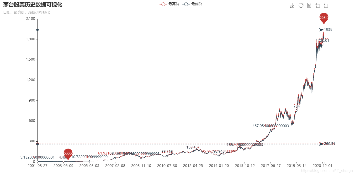
import pyecharts.options as optsfrom pyecharts.charts import Line ( Line(init_opts=opts.InitOpts(width='1200px', height='600px')) .add_xaxis(xaxis_data=price_dates) .add_yaxis(series_name='最高價',y_axis=heigh_prices,markpoint_opts=opts.MarkPointOpts( data=[opts.MarkPointItem(type_='max', name='最大值'),opts.MarkPointItem(type_='min', name='最小值'), ]),markline_opts=opts.MarkLineOpts( data=[opts.MarkLineItem(type_='average', name='平均值')]), ) .add_yaxis(series_name='最低價',y_axis=low_prices,markpoint_opts=opts.MarkPointOpts( data=[opts.MarkPointItem(value=-2, name='周最低', x=1, y=-1.5)]),markline_opts=opts.MarkLineOpts( data=[opts.MarkLineItem(type_='average', name='平均值'),opts.MarkLineItem(symbol='none', x='90%', y='max'),opts.MarkLineItem(symbol='circle', type_='max', name='最高點(diǎn)'), ]), ) .set_global_opts(title_opts=opts.TitleOpts(title='茅臺股票歷史數(shù)據(jù)可視化', subtitle='日期、最高價、最低價可視化'),tooltip_opts=opts.TooltipOpts(trigger='axis'),toolbox_opts=opts.ToolboxOpts(is_show=True),xaxis_opts=opts.AxisOpts(type_='category', boundary_gap=True), ) .render('everyDayPrice_change_line_chart2.html'))3 結(jié)果展示

到此這篇關(guān)于python實現(xiàn)股票歷史數(shù)據(jù)可視化分析案例的文章就介紹到這了,更多相關(guān)python股票數(shù)據(jù)可視化內(nèi)容請搜索好吧啦網(wǎng)以前的文章或繼續(xù)瀏覽下面的相關(guān)文章希望大家以后多多支持好吧啦網(wǎng)!
相關(guān)文章:
1. nestjs實現(xiàn)圖形校驗和單點(diǎn)登錄的示例代碼2. html小技巧之td,div標(biāo)簽里內(nèi)容不換行3. 以PHP代碼為實例詳解RabbitMQ消息隊列中間件的6種模式4. laravel ajax curd 搜索登錄判斷功能的實現(xiàn)5. Python基礎(chǔ)之numpy庫的使用6. Python 如何將integer轉(zhuǎn)化為羅馬數(shù)(3999以內(nèi))7. 將properties文件的配置設(shè)置為整個Web應(yīng)用的全局變量實現(xiàn)方法8. python實現(xiàn)自動化辦公郵件合并功能9. Echarts通過dataset數(shù)據(jù)集實現(xiàn)創(chuàng)建單軸散點(diǎn)圖10. css進(jìn)階學(xué)習(xí) 選擇符

 網(wǎng)公網(wǎng)安備