這種情景怎么解釋?display:flex 遭遇 white-space: nowrap;
問題描述
html如下,使用了flex-box布局,左邊圖片的img-box定寬,右邊的css定義了flex-item,然后對(duì)shop-name進(jìn)行了單行不換行截?cái)啵@時(shí)候就發(fā)現(xiàn)左邊的圖片被擠扁了,小于定的寬度。發(fā)生這個(gè)情況在chrome上,ios和安卓的微信下正常.
chrome效果見圖:
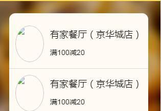
<a href="#" class="coupons-item flex"> <div class="img-box"><img src="1.jpg" /></div> <div class="flex-item"><h3 class="shop-name">有家餐廳(京華城店)</h3><div class="text">滿100減20</div> </div></a>
(scss)
.coupons-item{ padding:1rem; color:#000; text-decoration: none; border-bottom:1px solid $gray-border-color; .img-box{ width:6rem; height:6rem; margin-right:1rem; @include radius(50%); overflow: hidden; img{ display: block; width:100%; height:100%; @include radius(50%); } } .shop-name{ line-height:2; height:3.6rem; font-weight:normal; font-size:1.8rem; overflow: hidden; -ms-text-overflow: ellipsis; text-overflow: ellipsis; white-space: nowrap; } .text{ font-size:1.4rem; }}
問題解答
回答1:之前遇到過,解決辦法:首先.flex-item設(shè)置下最小寬度
min-width:0
然后.shopname設(shè)置下寬度
width:100%
相關(guān)文章:
1. nignx - docker內(nèi)nginx 80端口被占用2. docker網(wǎng)絡(luò)端口映射,沒有方便點(diǎn)的操作方法么?3. docker不顯示端口映射呢?4. javascript - nodejs調(diào)用qiniu的第三方資源抓取,返回401 bad token,為什么5. angular.js - angular內(nèi)容過長展開收起效果6. docker綁定了nginx端口 外部訪問不到7. java - 為什么此私有靜態(tài)變量能被訪問呢?8. dockerfile - 我用docker build的時(shí)候出現(xiàn)下邊問題 麻煩幫我看一下9. docker - 各位電腦上有多少個(gè)容器啊?容器一多,自己都搞混了,咋辦呢?10. thinkphp5.1學(xué)習(xí)時(shí)遇到session問題
 網(wǎng)公網(wǎng)安備